DS 2003: Communicating with Data
Fall 2026 · Mon/Wed/Fri · Sarah Groves · Syllabus · Computer setup guide · Canvas
Office hours: Fri 1–2 pm, Rm 437 (Sarah) · Wed 1–2 pm, Capital One Hub (Isabelle Lee, TA)
The four charts for the Fixing bad charts activity (Wed 9/30) and Lab 5 (nbviewer · download .ipynb). Pick one to redesign. The data behind each chart is on the Datasets page.
Chart A: US household income, 1995–2016
Percentage of US households in each income range, with average annual personal income and median annual household income over time. From a research paper on the “financialization” of the US economy.
Context: The paper argues the economy became more “financialized” from 1995 to 2016: more economic activity came from finance itself (like trading stocks) rather than from making and selling goods and services. The second figure shows how much finance grew. Your redesign must be one chart, but it should include data from this context.
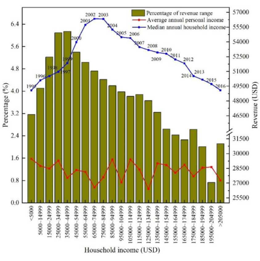
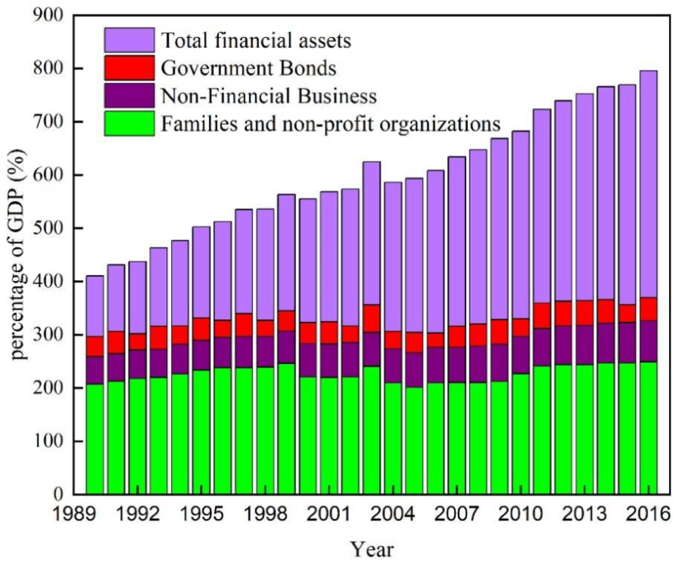
Chart B: Ranked rating in an online game
A player's ranked rating over time in the online game TETR.IO. Each point is one match, placed at the opponent's rating and colored by whether it was a win, loss, or (self-)disqualification.
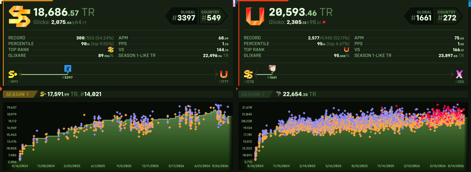
Chart C: Gun deaths in Florida
Firearm murders in Florida over time, with 2005 marked as the year the “Stand Your Ground” law was enacted (Reuters, 2014).
Context: Pair this chart with Pew Research Center's national firearm homicide and non-fatal violent crime rates, 1993–2011 (second figure). Your redesign must be one chart, but it should use information from both. The question you ask and the redesign you make should reflect the context of the Pew charts.
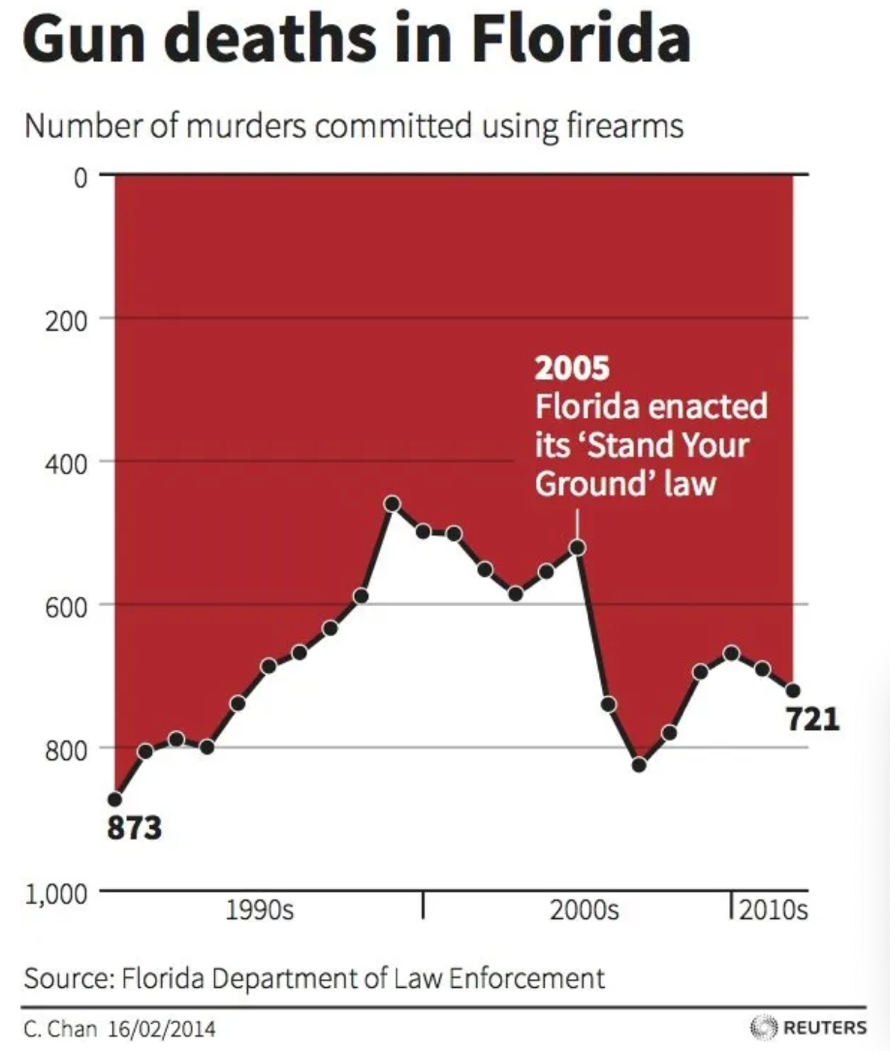
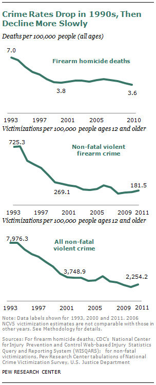
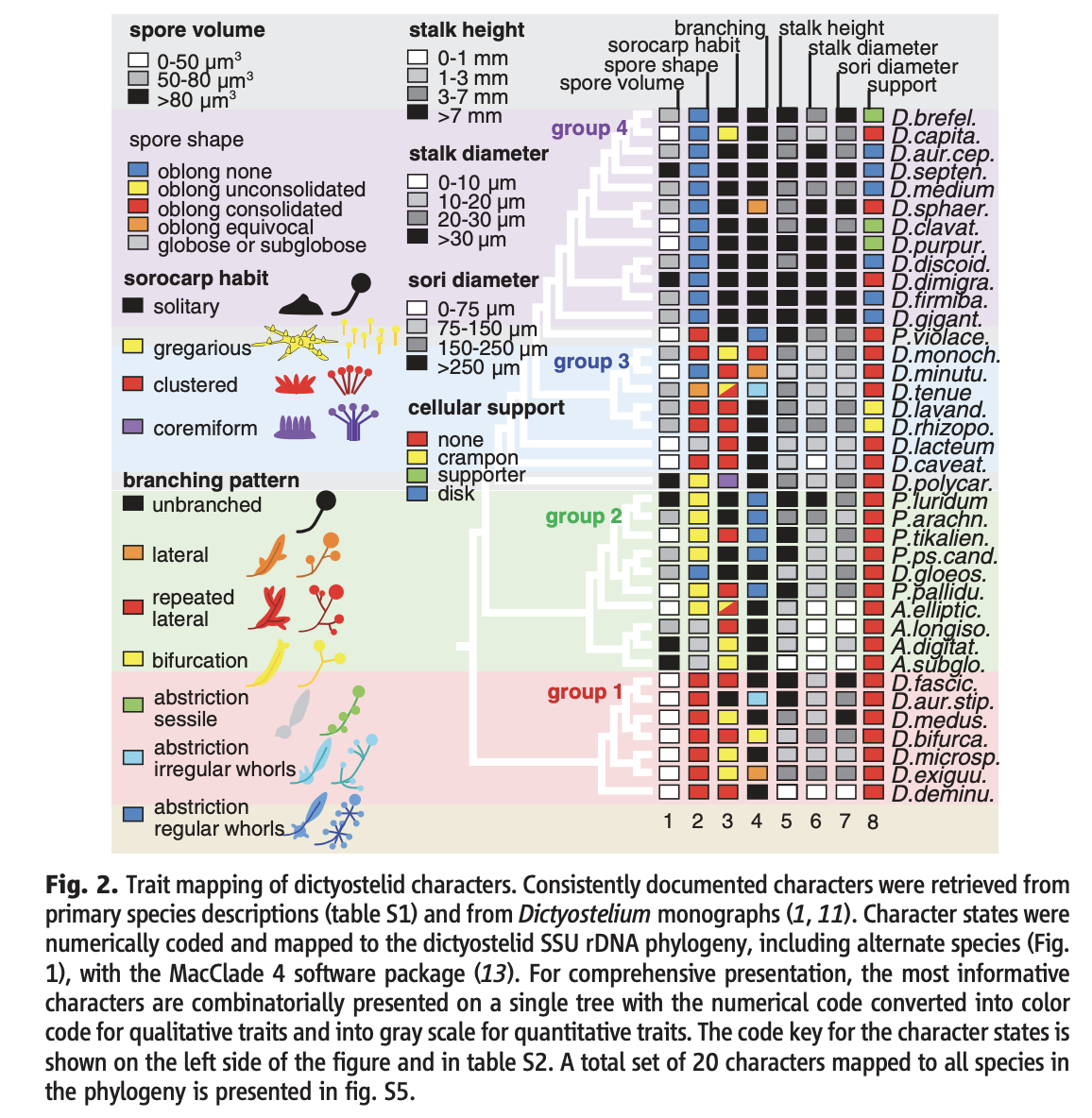
Chart D: Slime mold traits across a phylogeny
From a scientific paper on slime molds (dictyostelids). Based on their DNA, the species fall into four main groups on a phylogenetic tree showing how closely related they are; the colored and gray boxes show each species' traits.