Single Cell Analysis
I was a Guest Lecturer for this course at Vanderbilt University. Click here to see the RNA Velocity Tutorial I taught.
For my guest lecture, I taught the students how to use an RNA velocity package called velocyto, based on La Manno et al. (2018). I was asked to give the same lecture the following year. The notebook I used for the presentation and gave to the students is shown below, which provides an overview of RNA velocity analysis on a tumor dataset.
RNA Velocity
This notebook is an introduction to RNA velocity using the Python package velocyto. The code below is run on a dataset of Small Cell Lung Cancer mouse tumor cells, originally published in Wooten et al., 2019 (TKO1). The data was deposited in GEO under accession number GSE137749, and a loom file can be generated as described below (with velocyto’s command line interface).
Background on RNA Velocity
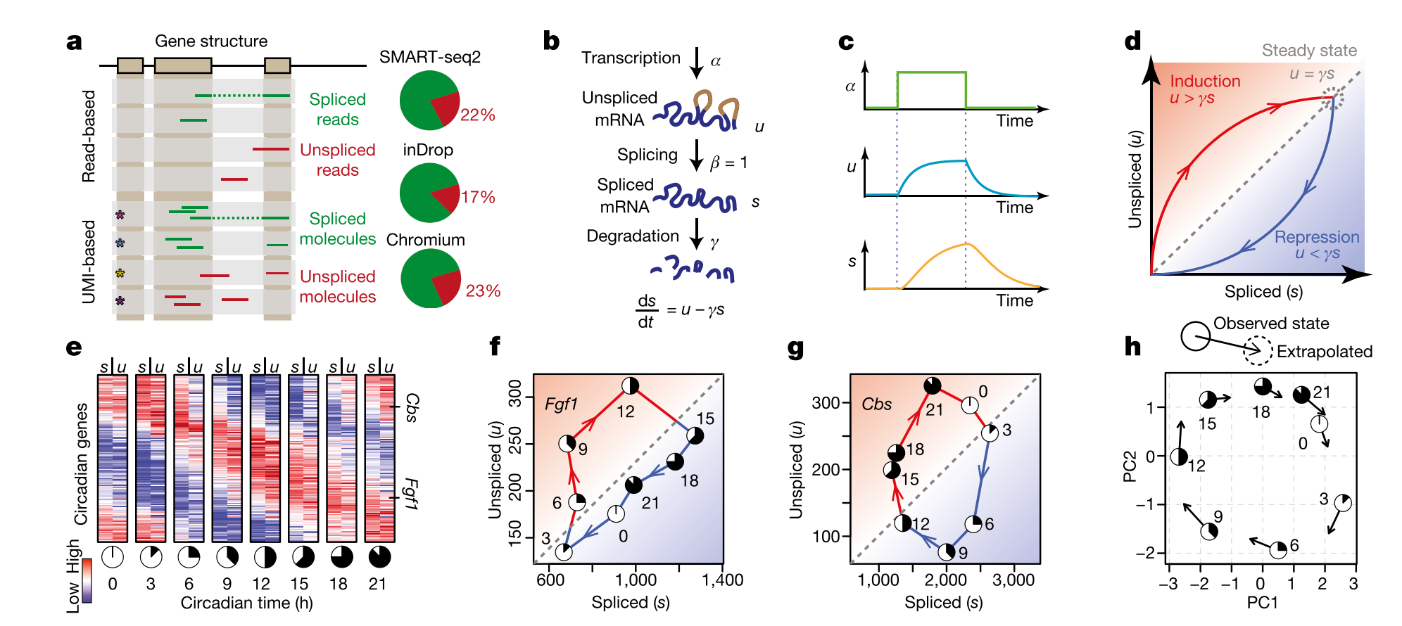
- A. Both read-based and UMI based techniques can be used to align unspliced and spliced reads. Usually % unspliced reads is around 15% to 20% (higher than expected in inDrop and other 3’-end based protocols because of internal splicing).
- B. Simple model used to calculate velocity. \(\alpha\) can be difficult to fit (rate of transcription), so other assumptions are necessary in order to solve the set of differential equations (constant velocity or constant unspliced counts per gene). \(\beta\) is set to one, so the units of time are in terms of the splicing rate. Most of the velocyto pipeline to calculate velocity involves fitting \(\gamma\), the degradation rate.
- C. Because of the time lag in splicing, a transcription rate increase will increase unspliced RNA faster than spliced RNA. This lag is also shown in E, where unspliced RNA from one timepoint can predict spliced RNA 3 hours later for circadian genes.
- D. If velocity = 0, then \(u = \gamma s\). Once we fit gamma for each gene, we can simply compare the unspliced and spliced counts for each gene for each cell to determine velocity. If \(u > \gamma s\), the velocity is positive (spliced reads will increase); likely, if less than, the velocity is negative. This is calculated for each gene for each cell.
- E. Example using circadian genes. This is a proof of principle, that we can predict future expression of RNA based on this model. Prediction is for a time step of approximately 3-4 hours, and trajectory analysis through the landscape based on velocity can extrapolate farther into the future. However, this assumes that there are no hidden variables in the model, and therefore cell trajectories are Markovian, and any form of cellular memory is encoded only in their measured RNA expression. In other words, a specific location in phenotypic space (i.e. a gene expression vector) has one defined velocity, and the properties of the cell available for measurement fully encode a probability distribution over its possible future states. Keep in mind that any trajectory analysis (graph-based or otherwise) that only considers RNA expression is also making this assumption.
- F. and G. Examples of two circadian genes over a 24 hour time course. Any circadian (cyclic) pattern of gene expression will be a loop in this space.
- H. Observed state versus extrapolated state based on RNA velocity in a PCA. Most of the plots we will look at will be like this: actually cells in PCA (or other dimensionality-reduced) space with arrows suggesting their extrapolated state. Importantly, to visualize these arrows (which may not actually align with the dimensionality reduction/transformation), we must embed the velocity arrows into that space as well. This allows us to predict both the future state of each cell (which does not need embedding) and the transition probabilities to other cell states in the landscape (which requires embedding).
Creation of loom file
First step in the velocyto pipeline is to generate a loom file that has both unspliced and spliced count matrices. More information on loom files: http://loompy.org/ However, velocyto has its own version of loom files, so some functions will be different. For example, we will read in a new loom file with the call: velocyto.VelocytoLoom('loom_file.loom'). I will assume we already have this loom file, generated by: http://velocyto.org/velocyto.py/tutorial/cli.html

Import packages
You must have downloaded: velocyto, MulticoreTSNE, bbknn and loompy. The other packages below are fairly common.
import numpy as np
import scanpy.api as sc
from MulticoreTSNE import MulticoreTSNE as TSNE
import os.path as op
import scanpy.external as sce
import bbknn
import sys
import matplotlib
import matplotlib.pyplot as plt
import loompy
import velocyto as vcy
import logging
from sklearn.neighbors.kde import KernelDensity
import pandas as pd

%matplotlib inline
sc.settings.verbosity = 3  # verbosity: errors (0), warnings (1), info (2), hints (3)
sc.settings.set_figure_params(dpi=80)  # low dpi (dots per inch) yields small inline figures
sc.logging.print_version_and_date()
# we will soon provide an update with more recent dependencies
sc.logging.print_versions_dependencies_numerics()
Running Scanpy 1.4 on 2019-03-18 10:03.
Dependencies: anndata==0.6.18 numpy==1.16.2 scipy==1.2.0 pandas==0.24.1 scikit-learn==0.20.2 statsmodels==0.9.0 python-igraph==0.7.1 louvain==0.6.1
Load loom file and preprocess spliced and unspliced count matrices
Code adapted from https://github.com/velocyto-team/velocyto-notebooks/blob/master/python/hgForebrainGlutamatergic.ipynb
You should be able to use an alternative preprocessing pipeline for the S matrix to filter cells and normalize. Then use the cell IDs to tranfer the preprocessing information into the loom file. I would be careful though with the U matrix, because all of the counts will be lower in general than S and you don’t necessarily want to filter out low counts. Velocyto has a method to filter U based on detection levels which is used below (min_expr_counts_U = 0).
In velocyto, you must first score the cells/genes and then actually filter them out with a different command, so make sure to include both when filtering.
# Replace with your loom file

vlm = vcy.VelocytoLoom('/Users/sarahmaddox/Quaranta_Lab/SCLC/scRNAseq/velocyto_loom/TK01.loom')
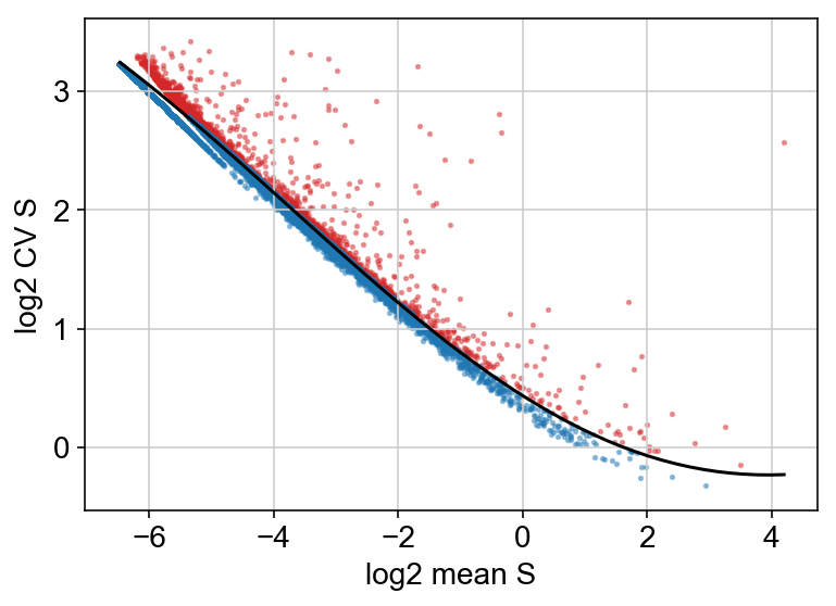
Below, I chose to plot the cv vs mean plot but did not filter on this criteria, because I wanted to be more conservative with the number of genes filtered out.
vlm.normalize("S", size=True, log=False)
vlm.normalize("U", size=True,  log=False)

vlm.score_detection_levels(min_expr_counts=30, min_cells_express=20,
                           min_expr_counts_U=0, min_cells_express_U=0)
vlm.filter_genes(by_detection_levels=True)

vlm.score_cv_vs_mean(2000, plot=True, max_expr_avg=50, winsorize=True, winsor_perc=(1,99.8), svr_gamma=0.01, min_expr_cells=50)
# vlm.filter_genes(by_cv_vs_mean=True)
Also normalize the cells using the (initial) total molecules as size estimate and then adjust the spliced count on the base of the relation S_sz_tot and U_sz_tot
vlm.score_detection_levels(min_expr_counts=0, min_cells_express=0,
                           min_expr_counts_U=25, min_cells_express_U=20)
vlm.normalize_by_total(min_perc_U=0.5)
vlm.adjust_totS_totU(normalize_total=True, fit_with_low_U=False, svr_C=1, svr_gamma=1e-04)
Run PCA
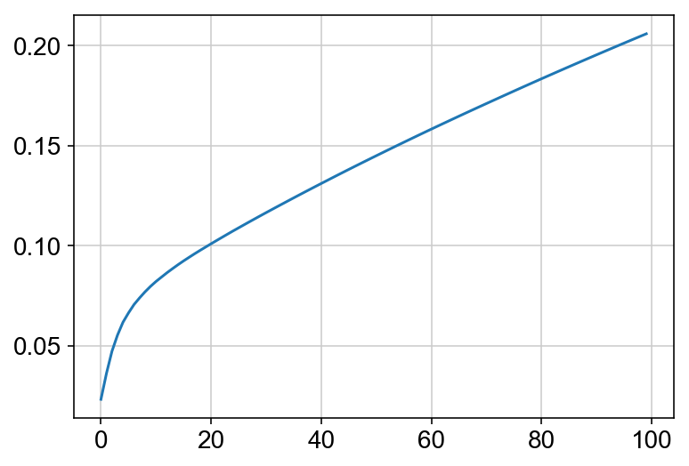
This must be done before the kNN imputation because the PCA dimensionality reduction is used to impute the nearest neighbors. Also I am plotting the cumulative sum of the explained variance ratio for the first 100 PCs. This is to help determine how many PCs to use for future analyses. Keep in mind that you can run other dimensionality reduction techniques, but I am choosing to plot everything using PCA.
vlm.perform_PCA()
plt.plot(np.cumsum(vlm.pca.explained_variance_ratio_)[:100])
n_comps = np.where(np.diff(np.diff(np.cumsum(vlm.pca.explained_variance_ratio_))>0.002))[0][0]
vlm.pcs[:,1] *= -1
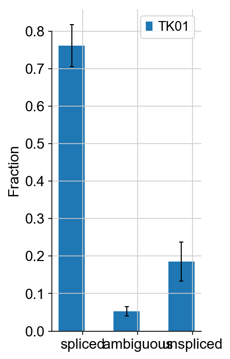
vlm.plot_fractions()
Cluster cells in PCA (or other dimensionality reduction)
Below code: R Function Princurve is implemented in python through rpy2
This is used to draw a principle curve through the graph based on the first few PC dimensions. Unnecessary for pipline but may help explain the data if there is a clear path through it.
# Wrap implementation
import rpy2.robjects as robj
from rpy2.robjects.packages import importr

def array_to_rmatrix(X):
    nr, nc = X.shape
    xvec = robj.FloatVector(X.transpose().reshape((X.size)))
    xr = robj.r.matrix(xvec, nrow=nr, ncol=nc)
    return xr

def principal_curve(X, pca=True):
    """
    input : numpy.array
    returns:
    Result::Object
        Methods:
        projections - the matrix of the projectiond
        ixsort - the order ot the points (as in argsort)
        arclength - the lenght of the arc from the beginning to the point
    """
    # convert array to R matrix
    xr = array_to_rmatrix(X)

    if pca:
        #perform pca
        t = robj.r.prcomp(xr)
        #determine dimensionality reduction
        usedcomp = max( sum( np.array(t[t.names.index('sdev')]) > 1.1) , 4)
        usedcomp = min([usedcomp, sum( np.array(t[t.names.index('sdev')]) > 0.25), X.shape[0]])
        Xpc = np.array(t[t.names.index('x')])[:,:usedcomp]
        # convert array to R matrix
        xr = array_to_rmatrix(Xpc)

    #import the correct namespace
    princurve = importr("princurve",on_conflict="warn")

    #call the function
    fit1 = princurve.principal_curve(xr)

    #extract the outputs
    class Results:
        pass
    results = Results()
    results.projections = np.array( fit1[0] )
    results.ixsort = np.array( fit1[1] ) - 1 # R is 1 indexed
    results.arclength = np.array( fit1[2] )
    results.dist = np.array( fit1[3] )

    if pca:
        results.PCs = np.array(xr) #only the used components

    return results
from sklearn.neighbors import NearestNeighbors
import igraph
nn = NearestNeighbors(50)
nn.fit(vlm.pcs[:,:4])
knn_pca = nn.kneighbors_graph(mode='distance')
knn_pca = knn_pca.tocoo()
G = igraph.Graph(list(zip(knn_pca.row, knn_pca.col)), directed=False, edge_attrs={'weight': knn_pca.data})
VxCl = G.community_multilevel(return_levels=False, weights="weight")
labels = np.array(VxCl.membership)

from numpy_groupies import aggregate, aggregate_np

pc_obj = principal_curve(vlm.pcs[:,:8], False)
pc_obj.arclength = np.max(pc_obj.arclength) - pc_obj.arclength
labels = np.argsort(np.argsort(aggregate_np(labels, pc_obj.arclength, func=np.median)))[labels]
manual_annotation = {str(i):[i] for i in labels}
annotation_dict = {v:k for k, values in manual_annotation.items() for v in values }
clusters = np.array([annotation_dict[i] for i in labels])
colors20 = np.vstack((plt.cm.tab20b(np.linspace(0., 1, 20))[::2], plt.cm.tab20c(np.linspace(0, 1, 20))[1::2]))
vlm.set_clusters(clusters, cluster_colors_dict={k:colors20[v[0] % 20,:] for k,v in manual_annotation.items()})
vlm.ca['Clusters'] = [int(i) for i in clusters]
/anaconda3/lib/python3.6/site-packages/rpy2/robjects/packages_utils.py:107: UserWarning: Conflict when converting R symbols in the package "princurve" to Python symbols:
-lines_principal_curve -> lines.principal_curve, lines.principal.curve
- plot_principal_curve -> plot.principal_curve, plot.principal.curve
- points_principal_curve -> points.principal_curve, points.principal.curve
  warn(msg)
kNN Imputation, gamma fitting, and velocity calculation
This is really the heart of the velocyto tool, and it only takes up a couple of lines. Most of the RNA velocity pipelines are calculating velocity and then spending a lot of time figuring out what to do with it, whether that is clustering, ordering cells in pseudotime, predicting trajectories through the data, visualizing, etc. The actual calculation of velocity is pretty simple.
k = 550
vlm.knn_imputation(n_pca_dims=n_comps,k=k, balanced=True,
                   b_sight=np.minimum(k*8, vlm.S.shape[1]-1),
                   b_maxl=np.minimum(k*4, vlm.S.shape[1]-1))
vlm.normalize_median() # not strictly necessary
vlm.fit_gammas(maxmin_perc=[2,95], limit_gamma=True) # fit gammas; because this step is so important, double
#check the API to make sure you are using the correct settings for your specific dataset
vlm.normalize(which="imputed", size=False, log=True) # not strictly necessary
vlm.Pcs = np.array(vlm.pcs[:,:2], order="C") # defining Pcs as a array based on the pcs attribute we calculated earlier
vlm.predict_U() # predict U (gamma * S) given the gamma model fit
vlm.calculate_velocity() # calculate velocity of each cell
vlm.calculate_shift() # Find the change (deltaS) in gene expression for every cell
vlm.extrapolate_cell_at_t(delta_t=1) # Extrapolate the gene expression profile for each cell after delta_t (arbitrary units)
For whatever reason, the loom file started to not allow conversion to HDF5 file. Apparently the cluster labels are in the wrong format, as specified: https://github.com/velocyto-team/velocyto.py/issues/40
The below line should fix this.
vlm.cluster_labels=vlm.cluster_labels.astype(np.string_) #not strictly necessary
vlm.to_hdf5('vlm_tk01_example')
Estimate transition probabilities, calculate embedding shift, and calculate velocity field (averaged grid) arrows
When estimating probability of transitioning to another cell, you must embed the velocity arrows into the manifold and thus must specify this by embed. The other settings are explained below.
 |  |
#########################################
#### Do not run in jupyter notebook #####
#########################################
import os
import loompy
import velocyto as vcy
vlm = vcy.load_velocyto_hdf5('vlm_tk01_example')
os.environ['KMP_DUPLICATE_LIB_OK']='True'
vlm.estimate_transition_prob(hidim="Sx_sz", embed="Pcs", transform="log", psc=1,
                             n_neighbors=2000, knn_random=True, sampled_fraction=0.5)
vlm.to_hdf5('vlm_tk01_example')
#########################################
vlm = vcy.load_velocyto_hdf5('vlm_tk01_example')
vlm.calculate_embedding_shift(sigma_corr = 0.05, expression_scaling=False)

vlm.calculate_grid_arrows(smooth=0.9, steps=(50, 50), n_neighbors=200)
Plot cells with velocity embedded
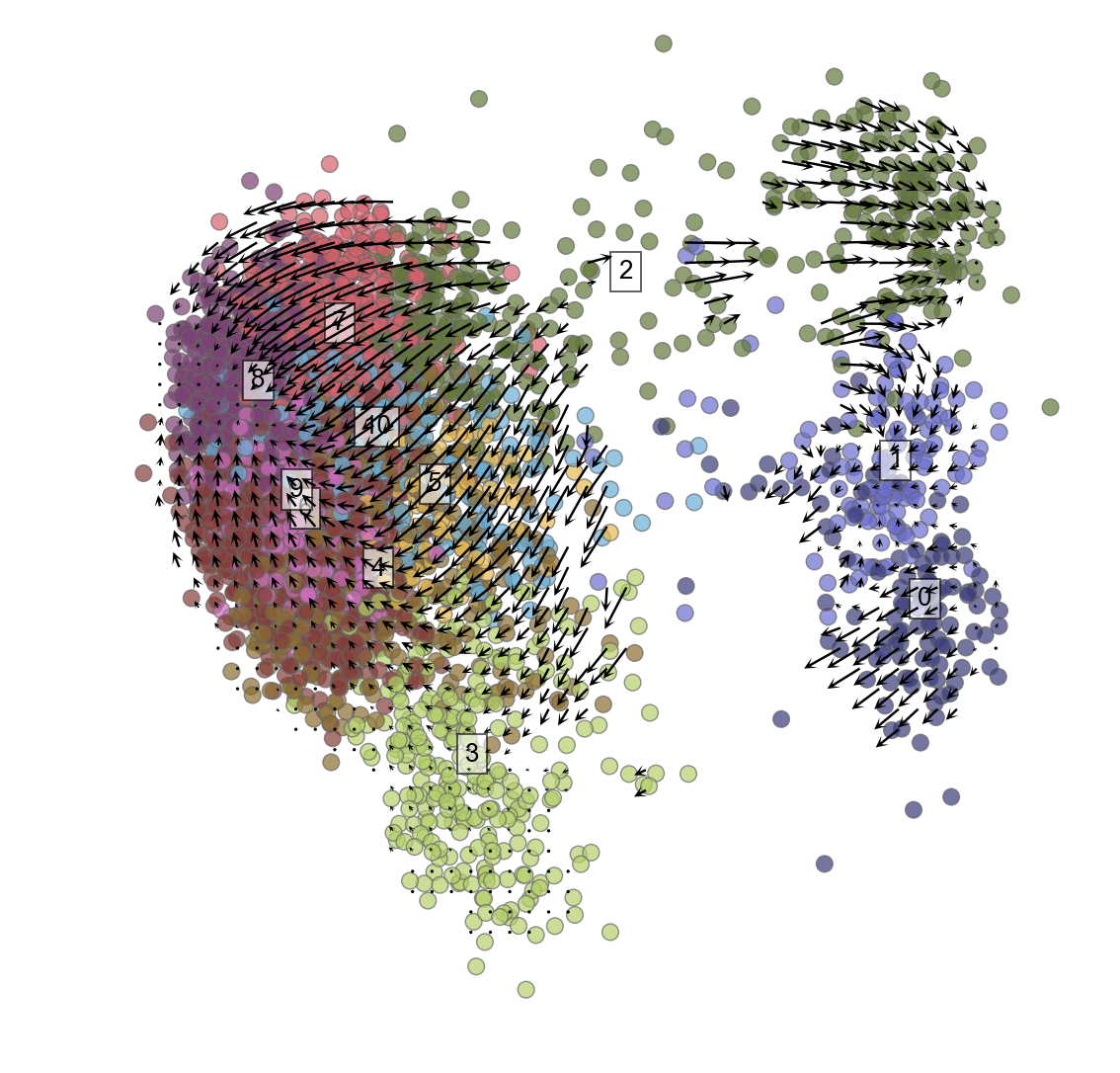
Because of the weird problem noted above that requires this line to fix: vlm.cluster_labels=vlm.cluster_labels.astype(np.string_) You may need to rerun the clustering of cells to get the cluster names in the right format (ints) that you can then iterate through to plot below.
plt.figure(None,(9,9))
vlm.plot_grid_arrows(scatter_kwargs_dict={"alpha":0.7, "lw":0.7, "edgecolor":"0.4", "s":70, "rasterized":True},
                     min_mass=2.9, angles='xy', scale_units='xy', #plot_random=True,
                     headaxislength=2.75, headlength=5, headwidth=4.8, quiver_scale=0.35, scale_type="relative")
#plt.plot(pc_obj.projections[pc_obj.ixsort,0], pc_obj.projections[pc_obj.ixsort,1], c="w", lw=6, zorder=1000000)
#plt.plot(pc_obj.projections[pc_obj.ixsort,0], pc_obj.projections[pc_obj.ixsort,1], c="k", lw=3, zorder=2000000)

for i in range(max(vlm.ca["Clusters"])+1):
    pc_m = np.median(vlm.pcs[[x == str(i) for x in vlm.cluster_labels], :], 0)
    plt.text(pc_m[0], pc_m[1], str(vlm.cluster_labels[[x == str(i) for x in vlm.cluster_labels]][0]),
             fontsize=13, bbox={"facecolor":"w", "alpha":0.6})
plt.axis("off")
plt.axis("equal")
# plt.savefig('grid_arrows_velfield.pdf')
(-6.179891076443215,
 15.366726792232903,
 -12.449288968577802,
 10.019450217263424)
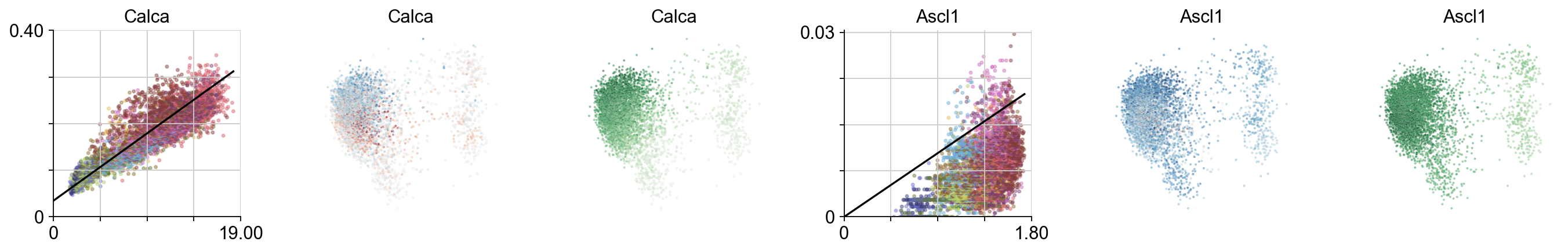
Specific genes expressed throughout PCA plot
# plotting utility functions
def despline():
    ax1 = plt.gca()
    # Hide the right and top spines
    ax1.spines['right'].set_visible(False)
    ax1.spines['top'].set_visible(False)
    # Only show ticks on the left and bottom spines
    ax1.yaxis.set_ticks_position('left')
    ax1.xaxis.set_ticks_position('bottom')

def minimal_xticks(start, end):
    end_ = np.around(end, -int(np.log10(end))+1)
    xlims = np.linspace(start, end_, 5)
    xlims_tx = [""]*len(xlims)
    xlims_tx[0], xlims_tx[-1] = f"{xlims[0]:.0f}", f"{xlims[-1]:.02f}"
    plt.xticks(xlims, xlims_tx)


def minimal_yticks(start, end):
    end_ = np.around(end, -int(np.log10(end))+1)
    ylims = np.linspace(start, end_, 5)
    ylims_tx = [""]*len(ylims)
    ylims_tx[0], ylims_tx[-1] = f"{ylims[0]:.0f}", f"{ylims[-1]:.02f}"
    plt.yticks(ylims, ylims_tx)
plt.figure(None, (17,2.8), dpi=80)
gs = plt.GridSpec(1,6)
for i, gn in enumerate(["Calca", 'Ascl1']):
    ax = plt.subplot(gs[i*3])
    try:
        ix=np.where(vlm.ra["Gene"] == gn)[0][0]
    except:
        continue
    vcy.scatter_viz(vlm.Sx_sz[ix,:], vlm.Ux_sz[ix,:], c=vlm.colorandum, s=5, alpha=0.4, rasterized=True)
    plt.title(gn)
    xnew = np.linspace(0,vlm.Sx[ix,:].max())
    plt.plot(xnew, vlm.gammas[ix] * xnew + vlm.q[ix], c="k")
    plt.ylim(0, np.max(vlm.Ux_sz[ix,:])*1.02)
    plt.xlim(0, np.max(vlm.Sx_sz[ix,:])*1.02)
    minimal_yticks(0, np.max(vlm.Ux_sz[ix,:])*1.02)
    minimal_xticks(0, np.max(vlm.Sx_sz[ix,:])*1.02)
    despline()

    vlm.plot_velocity_as_color(gene_name=gn, gs=gs[i*3+1], s=3, rasterized=True, which_tsne='pcs')

    vlm.plot_expression_as_color(gene_name=gn, gs=gs[i*3+2], s=3, rasterized=True, which_tsne='pcs')

plt.tight_layout()
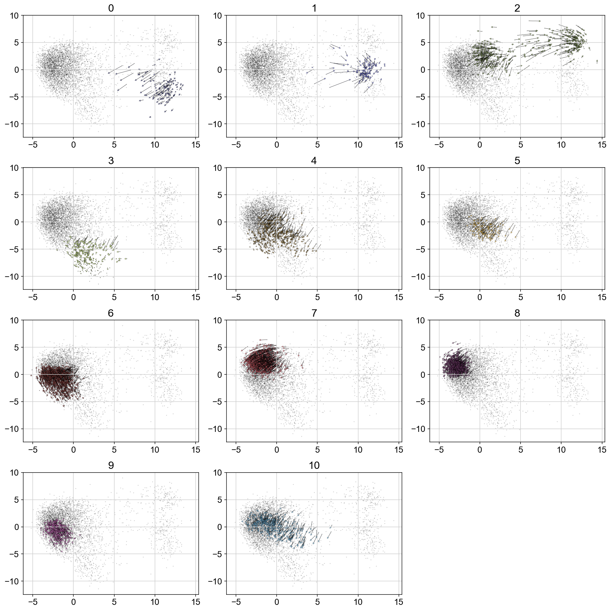
Velocity by igraph cluster
plt.figure(None, (14,14))
gs = plt.GridSpec(4,3)
for i, t in enumerate(range(max(vlm.ca["Clusters"])+1)):
    quiver_scale = 2.5
    q = vlm.cluster_labels == str(t)
    treat_index = [i for i, x in enumerate(q) if x]
#     treat_index = np.where(vlm.ca['Clusters'] == str(t))[0]
    treat_index = np.random.choice(treat_index, size=len(treat_index), replace=False)

    plt.subplot(gs[i])
    plt.title(t, size='xx-large')

    plt.scatter(vlm.embedding[:, 0], vlm.embedding[:, 1], c="k", alpha=0.2, s=2, edgecolor="")

    ix_choice = np.random.choice(vlm.embedding.shape[0], size=int(vlm.embedding.shape[0]/1.), replace=False)
    quiver_kwargs=dict(headaxislength=20, headlength=20, headwidth=20,linewidths=0.25, width=0.00045,edgecolors="k", color=vlm.colorandum[treat_index], alpha=0.7)
    plt.quiver(vlm.embedding[treat_index, 0], vlm.embedding[treat_index, 1],
           vlm.delta_embedding[treat_index, 0], vlm.delta_embedding[treat_index, 1],
           scale=quiver_scale, **quiver_kwargs)


plt.tight_layout()
# plt.savefig('figures/arrows_by_igraph_cluster.pdf')
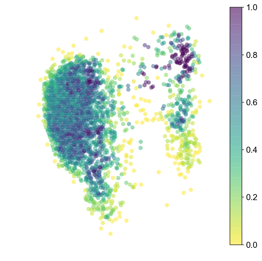
Markov Chain (run forward and backwards)
steps = 100, 100
grs = []
for dim_i in range(vlm.embedding.shape[1]):
    m, M = np.min(vlm.embedding[:, dim_i]), np.max(vlm.embedding[:, dim_i])
    m = m - 0.025 * np.abs(M - m)
    M = M + 0.025 * np.abs(M - m)
    gr = np.linspace(m, M, steps[dim_i])
    grs.append(gr)

meshes_tuple = np.meshgrid(*grs)
gridpoints_coordinates = np.vstack([i.flat for i in meshes_tuple]).T

from sklearn.neighbors import NearestNeighbors
nn = NearestNeighbors()
nn.fit(vlm.embedding)
dist, ixs = nn.kneighbors(gridpoints_coordinates, 1)

diag_step_dist = np.sqrt((meshes_tuple[0][0,0] - meshes_tuple[0][0,1])**2 + (meshes_tuple[1][0,0] - meshes_tuple[1][1,0])**2)
min_dist = diag_step_dist / 2
ixs = ixs[dist < min_dist]
gridpoints_coordinates = gridpoints_coordinates[dist.flat[:]<min_dist,:]
dist = dist[dist < min_dist]

ixs = np.unique(ixs)
vlm.prepare_markov(sigma_D=diag_step_dist, sigma_W=diag_step_dist/2., direction='backwards', cells_ixs=ixs)
vlm.run_markov(starting_p=np.ones(len(ixs)), n_steps=2500)
diffused_n = vlm.diffused - np.percentile(vlm.diffused, 3)
diffused_n /= np.percentile(diffused_n, 97)
diffused_n = np.clip(diffused_n, 0, 1)

plt.figure(None,(7,7))
ax = vcy.scatter_viz(vlm.embedding[ixs, 0], vlm.embedding[ixs, 1],
                c=diffused_n, alpha=0.5, s=50, lw=0.,
                edgecolor="", cmap="viridis_r", rasterized=True)
plt.colorbar(ax)

plt.axis("off")
plt.savefig("figures/startpoint_distr.pdf")
Trajectories of MCMC
def cluster_start(ixs, cluster):
    s = [0]*len(ixs)
    indices_pick = list(set(ixs).intersection(cluster))
    st_ind = np.random.choice(indices_pick)
    for el in  [i for i, x in enumerate(ixs == st_ind) if x]:
        s[el] = 1
    return np.array(s)
#run MCMC from cluster 1
c = []
for i in np.where(vlm_embed['1'])[0]:
    c.append(i)

vlm.prepare_markov(sigma_D=diag_step_dist, sigma_W=diag_step_dist/2, direction='forward', cells_ixs=ixs)
# vlm.run_markov(n_steps=2500, mode = 'trajectory')
start = cluster_start(ixs, c)

# start = np.ones(len(ixs))/len(ixs)
diffusor = vcy.diffusion.Diffusion()
vlm.diffused_traj = diffusor.diffuse(start, vlm.tr, n_steps=100, mode='trajectory')


visits = [[ixs[x],vlm.diffused_traj.count(x)] for x in set(vlm.diffused_traj)]
col = [0]*len(vlm.embedding)
for i in range(len(visits)):
    col[visits[i][0]] = visits[i][1]
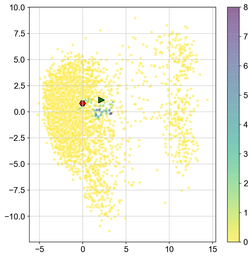
plt.figure(None,(7,7))
ax1 = plt.scatter(vlm.embedding[ixs, 0],vlm.embedding[ixs, 1],
                c=[col[i] for i in ixs], alpha=0.5, s=20, lw=0.,
                edgecolor="", cmap="viridis_r")
plt.plot(vlm.embedding[ixs[vlm.diffused_traj], 0], vlm.embedding[ixs[vlm.diffused_traj], 1], alpha = 0.5, lw = .2)
plt.scatter(vlm.embedding[ixs[vlm.diffused_traj[0]], 0], vlm.embedding[ixs[vlm.diffused_traj[0]], 1],
            marker='>', s=100, lw=1, edgecolor="k", c='g')
plt.scatter(vlm.embedding[ixs[vlm.diffused_traj[-1]], 0], vlm.embedding[ixs[vlm.diffused_traj[-1]], 1],
            marker='H', s=100, lw=1, edgecolor="k", c = 'r')
plt.colorbar(ax1)
<matplotlib.colorbar.Colorbar at 0x142581240>
Run multiple MCMC walks to get a sense of where each cluster goes
def random_start(ixs):
    s = [0]*len(ixs)
    s[np.random.randint(len(ixs))] = 1
    return np.array(s)
def specific_start(ixs, st_ind):
    s = [0]*len(ixs)
    for el in  [i for i, x in enumerate(ixs == st_ind) if x]:
        s[el] = 1
    return np.array(s)
ss = specific_start(ixs, 20)
ss
array([0, 0, 0, ..., 0, 0, 0])
from collections import Counter
def get_trajectory(vlm, ixs, n_steps = 250, start_p = np.ones(len(ixs))/len(ixs), iters = 3):
col = [0]*len(vlm.embedding)
col_count = [0]*len(vlm.embedding)
diffusor = vcy.diffusion.Diffusion()
for i in range(iters):
vlm.diffused_traj = diffusor.diffuse(start_p, vlm.tr, n_steps=n_steps, mode='trajectory')
visits = [[ixs[x],vlm.diffused_traj.count(x)] for x in set(vlm.diffused_traj)]
for i in range(len(visits)):
col[visits[i][0]] = visits[i][1]
col_count[visits[i][0]] += visits[i][1]
return col_count
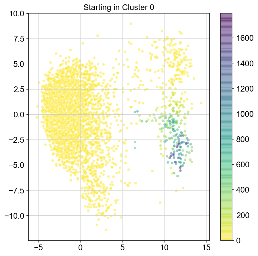
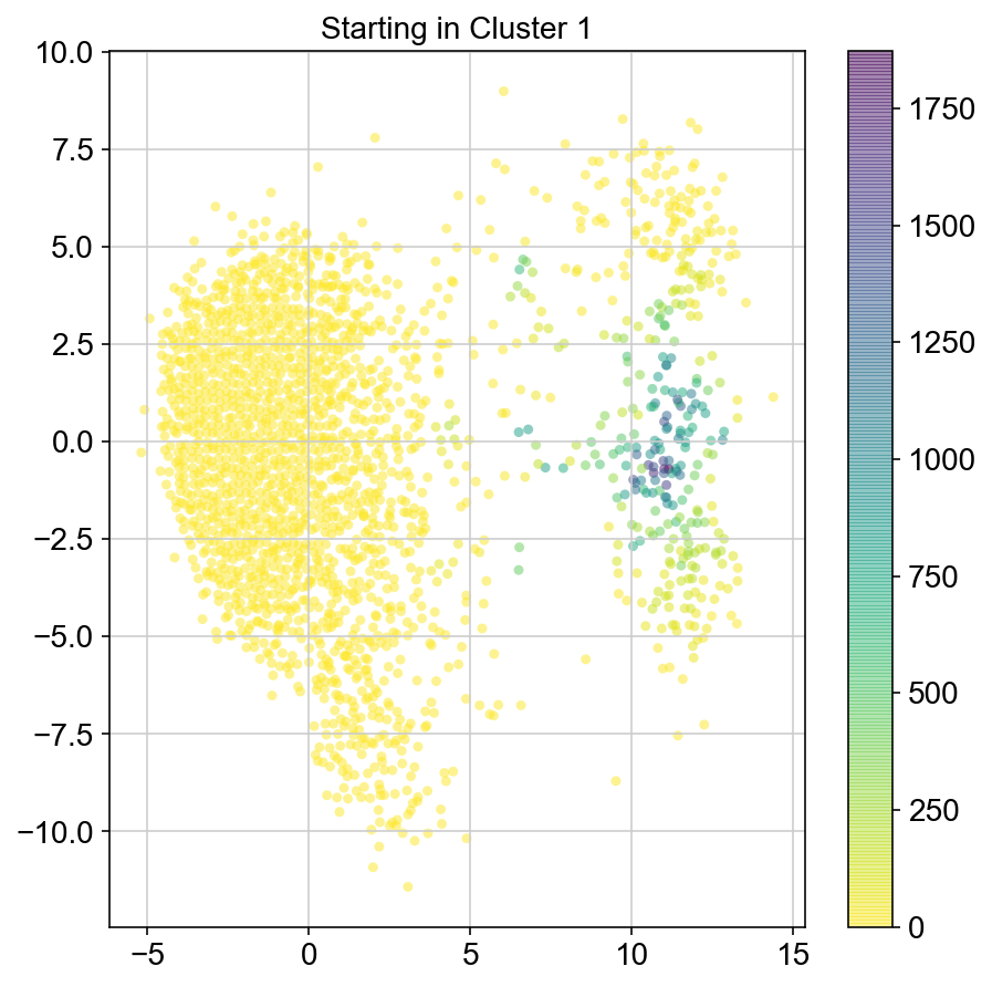
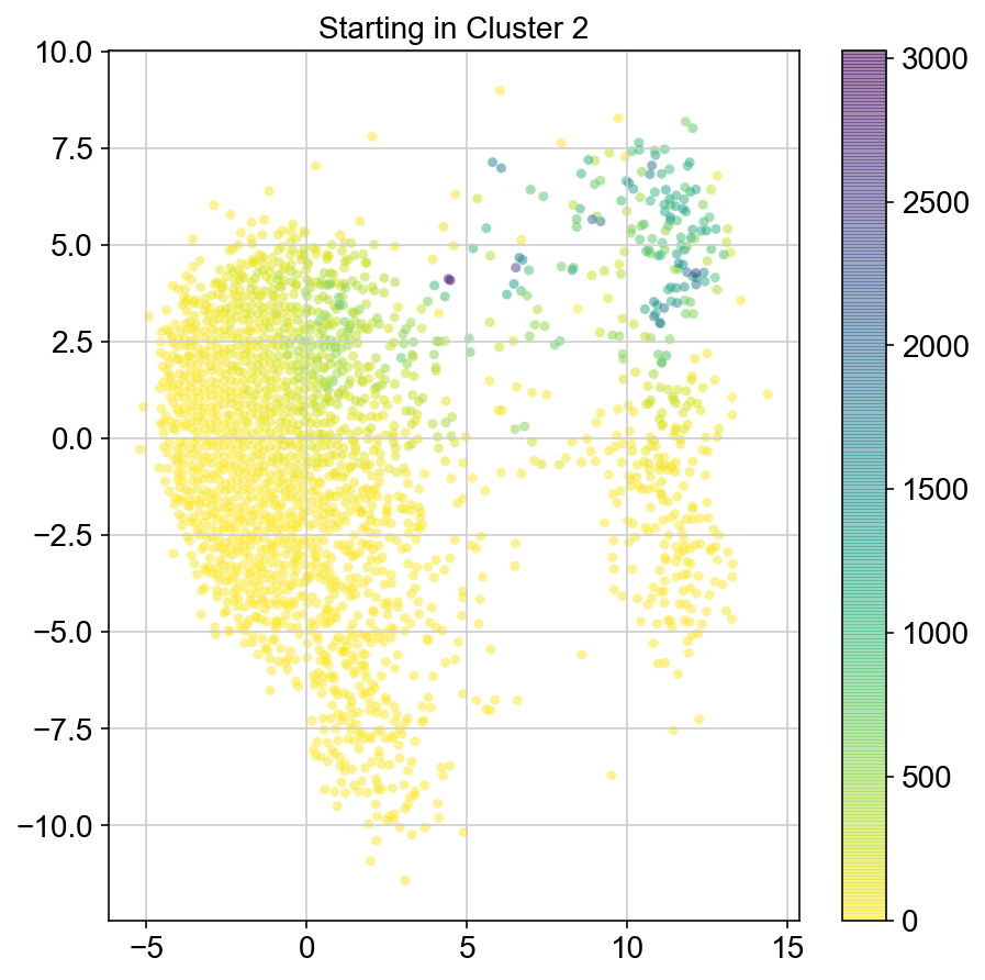
col_count_list = []
# for each point in a certain cluster, run the simulation multiple times. grab the indices of nonzeroes in col and check
# which clusters they are in. plot a barplot of % of time you get to each cluster
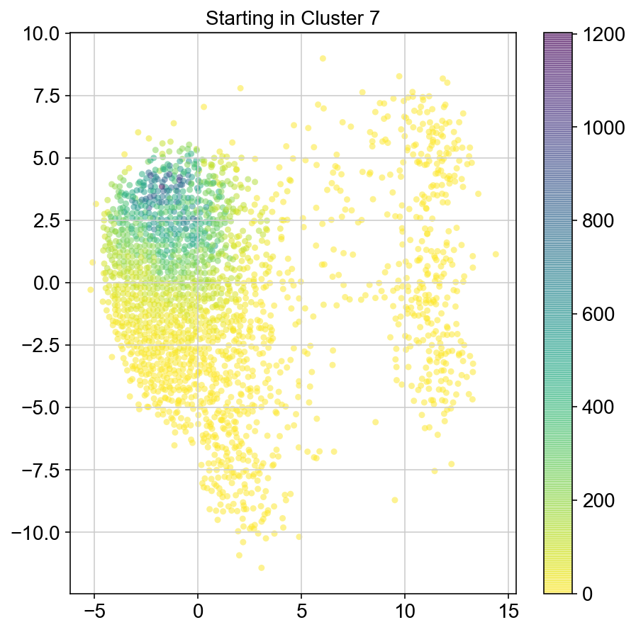
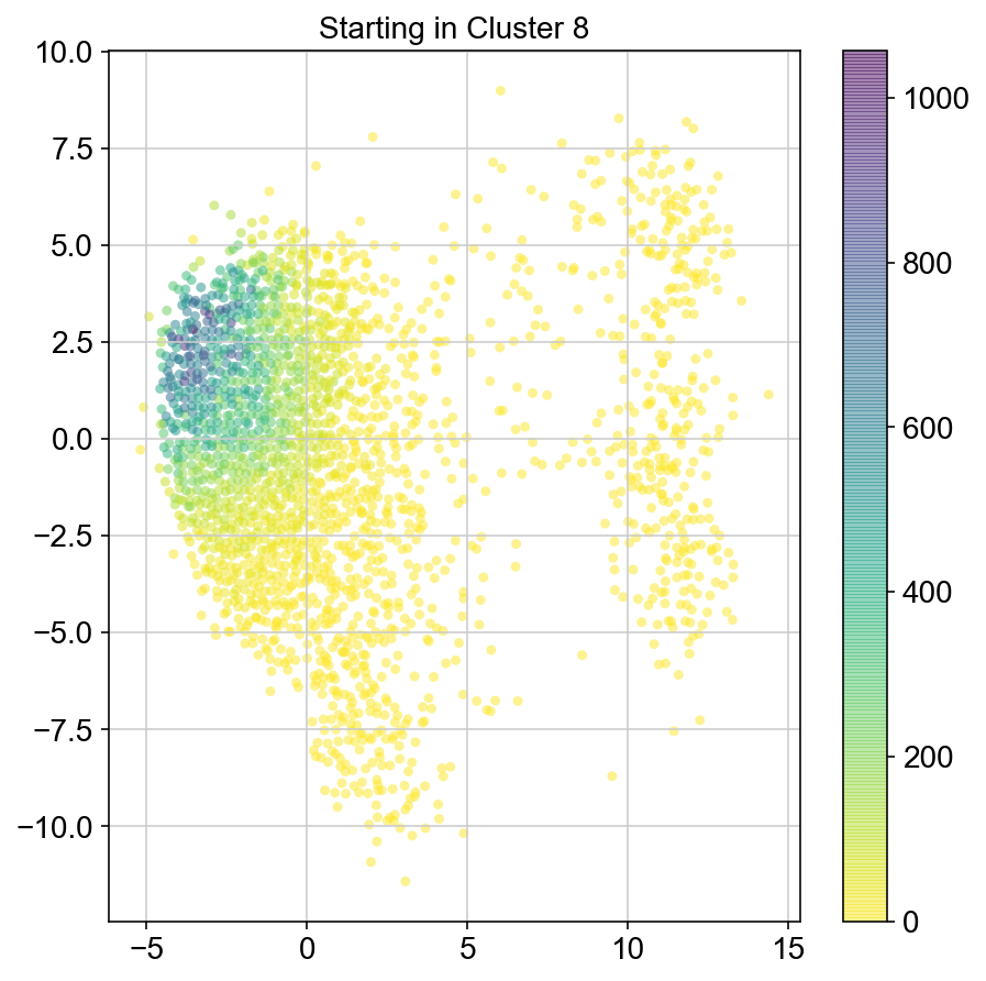
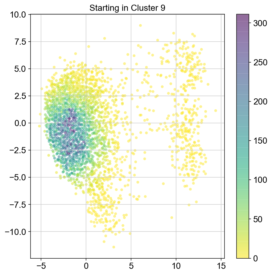
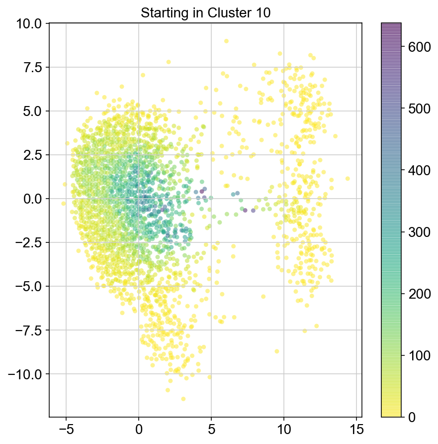
for clust in ['0','1','2','3','4','5','6','7','8','9','10']:
total = [0]*len(vlm.embedding)
#Need to get indices of points in chosen cluster that are ALSO in ixs list
print(clust)
for q in list(set(ixs).intersection(set([i for i, x in enumerate(vlm.cluster_labels == clust) if x]))):
ss = specific_start(ixs, q)
first = total
col_count = get_trajectory(vlm, ixs, n_steps=100, start_p = ss, iters = 10)
second = col_count
total = [x + y for x, y in zip(first, second)]
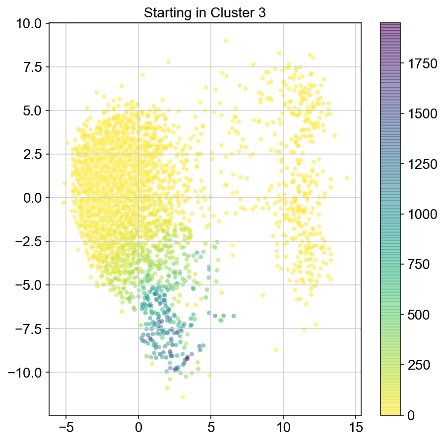
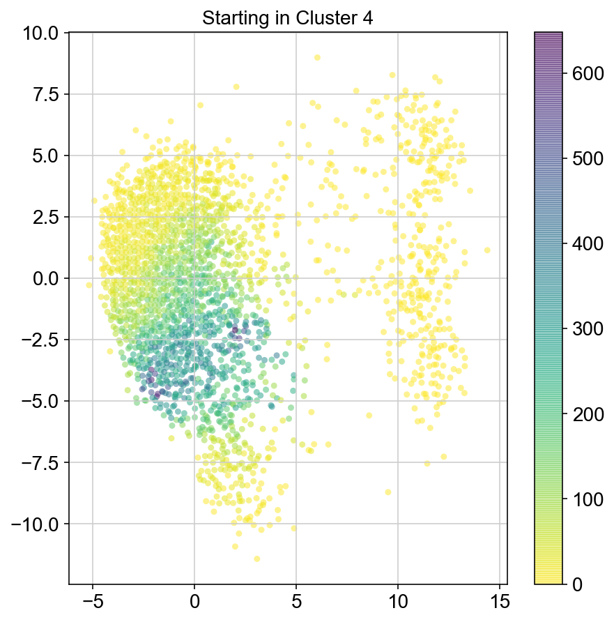
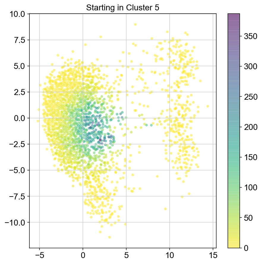
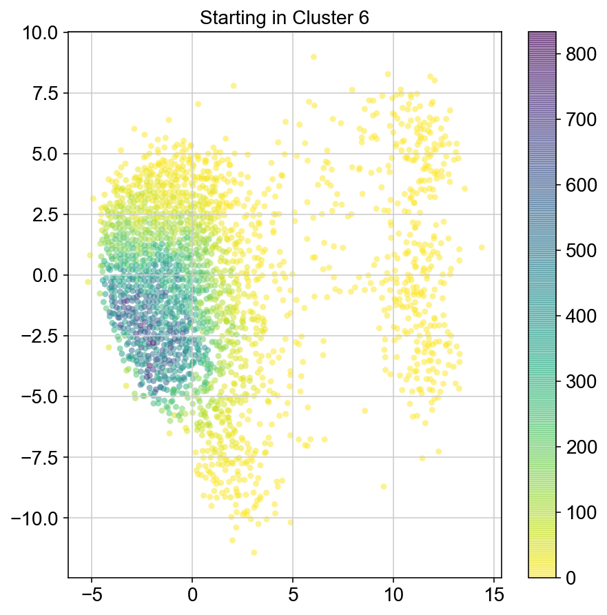
plt.figure(None,(7,7))
ax = plt.scatter(vlm.embedding[ixs, 0],vlm.embedding[ixs, 1],
c=[total[i] for i in ixs], alpha=0.5, s=20, lw=0.,
edgecolor="", cmap="viridis_r")
plt.title("Starting in Cluster "+clust)
plt.colorbar(ax)
plt.savefig(f'Cluster{clust}_distr_visited.pdf')
plt.show()
col_count_list.append(total)
0
1
2
3
4
5
6
7
8
9
10
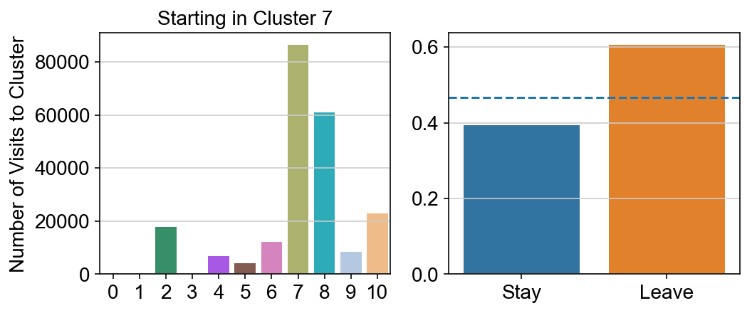
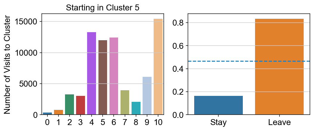
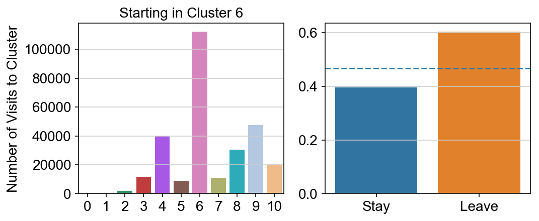
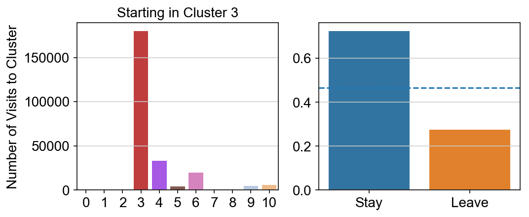
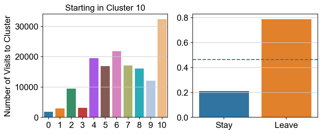
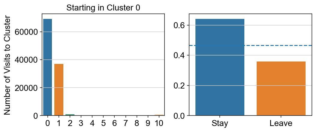
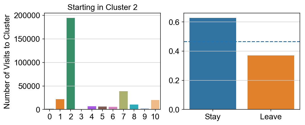
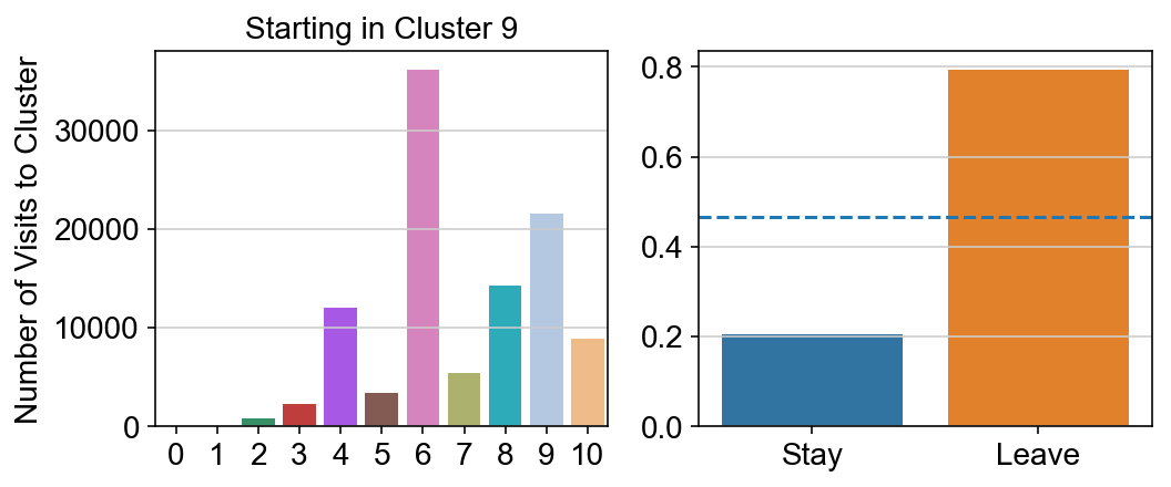
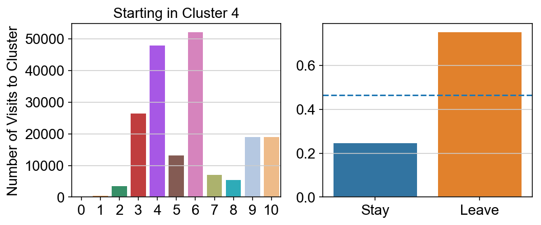
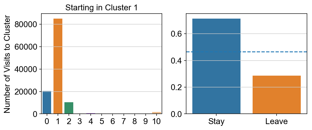
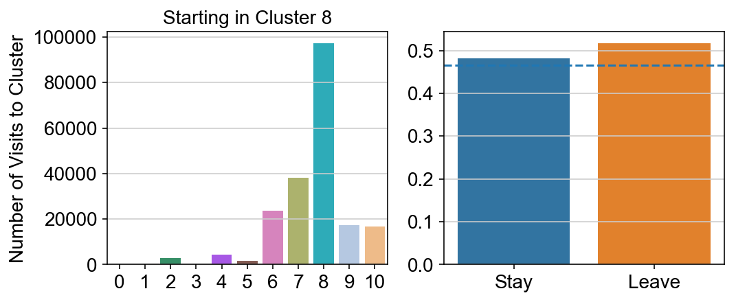
col_count_list is a list of the total number of visits to each datapoint starting in each cluster (list len 11 of arrays with length 4514)
For each array in the list (\(0<i<10\)), check the sum of visits within i versus not i and compare.
import seaborn as sns
leaving = pd.DataFrame([[0]*11]*11,columns=list(set(vlm.cluster_labels)), index = list(set(vlm.cluster_labels)))
for i,r in leaving.iterrows():
    start_clust = col_count_list[int(i)]
    for clust in ['0','1','2','3','4','5','6','7','8','9','10']:
        count = 0
        for q in [i for i, x in enumerate(vlm.cluster_labels == clust) if x]:
            count += start_clust[q]
        leaving.loc[i,clust] = count
    plt.figure(None, (8,3))
    gs = plt.GridSpec(1,2)
    plt.subplot(gs[0])
    g = sns.barplot(leaving.columns, leaving.loc[i], order = ['0','1','2','3','4','5','6','7','8','9','10'])
    plt.title("Starting in Cluster "+ i)
    plt.ylabel("Number of Visits to Cluster")
    plt.subplot(gs[1])
    g = sns.barplot(["Stay",'Leave'], [leaving.loc[i,i]/leaving.loc[i,:].sum(), leaving.loc[i, leaving.columns != i].sum()/leaving.loc[i,:].sum()])
    ax = g.axes
    ax.axhline(0.466059,ls = "--")
    plt.savefig(f"prob_leaving_start_in_{i}.pdf")
    plt.show()
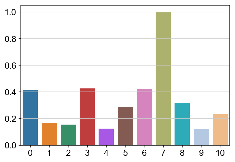
# probability of ending in each cluster
lengths = []
for c in ['0','1','2','3','4','5','6','7','8','9','10']:
    lengths.append(len([i for i, x in enumerate(vlm.cluster_labels == c) if x]))

sns.barplot(leaving.columns, leaving.sum(axis = 0)/lengths/max(leaving.sum(axis = 0)/lengths),  order = ['0','1','2','3','4','5','6','7','8','9','10'])
<matplotlib.axes._subplots.AxesSubplot at 0x13718cdd8>